BlogTO App
Setting
BlogTO is a website that source Toronto's local news and culture, restaurant reviews, event listings and the best of the city. I've always been a fan of BlogTO and have always wanted a site that is very local and catered to people who are adventurous and want to experience Toronto rather it’s through food or events.
Challenge
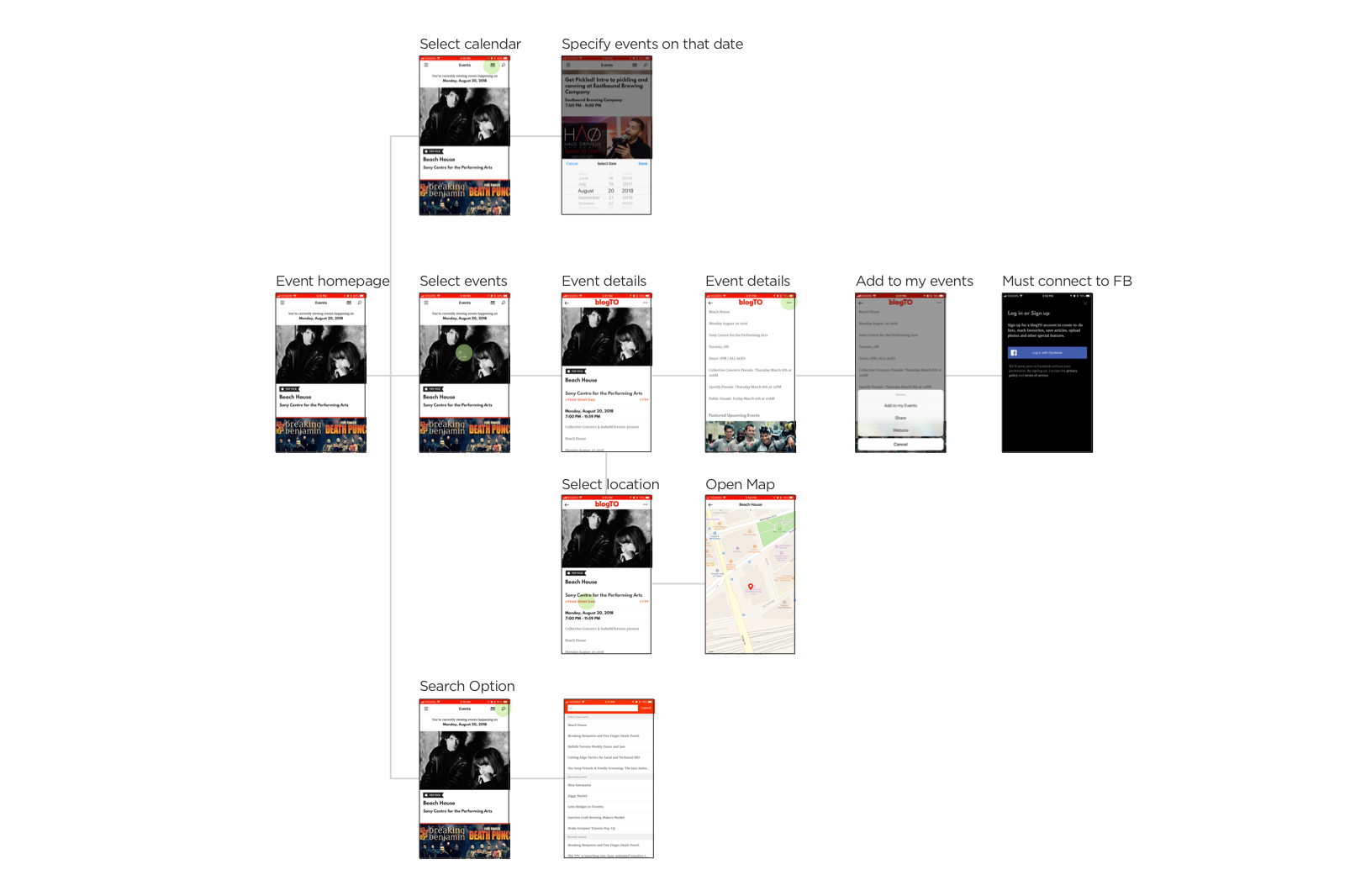
After using the current event page, I've noticed a couple of issues:
- • Users are provided with very limited search options.
- • No filters available, as a result lacks the personalization for specific users (i.e. kids content, concerts only fanatics)
- • A lot of scrolling and clicking in order to get to the actual content, making it seems like a long process
- • Navigation is hidden, making it less engaging for users to click and select
- • Search bar is not visually eye-catching, which can be seen as hidden
Goal & Deliverables
To improve the overall user experience and reduce the cognitive effort, we have:
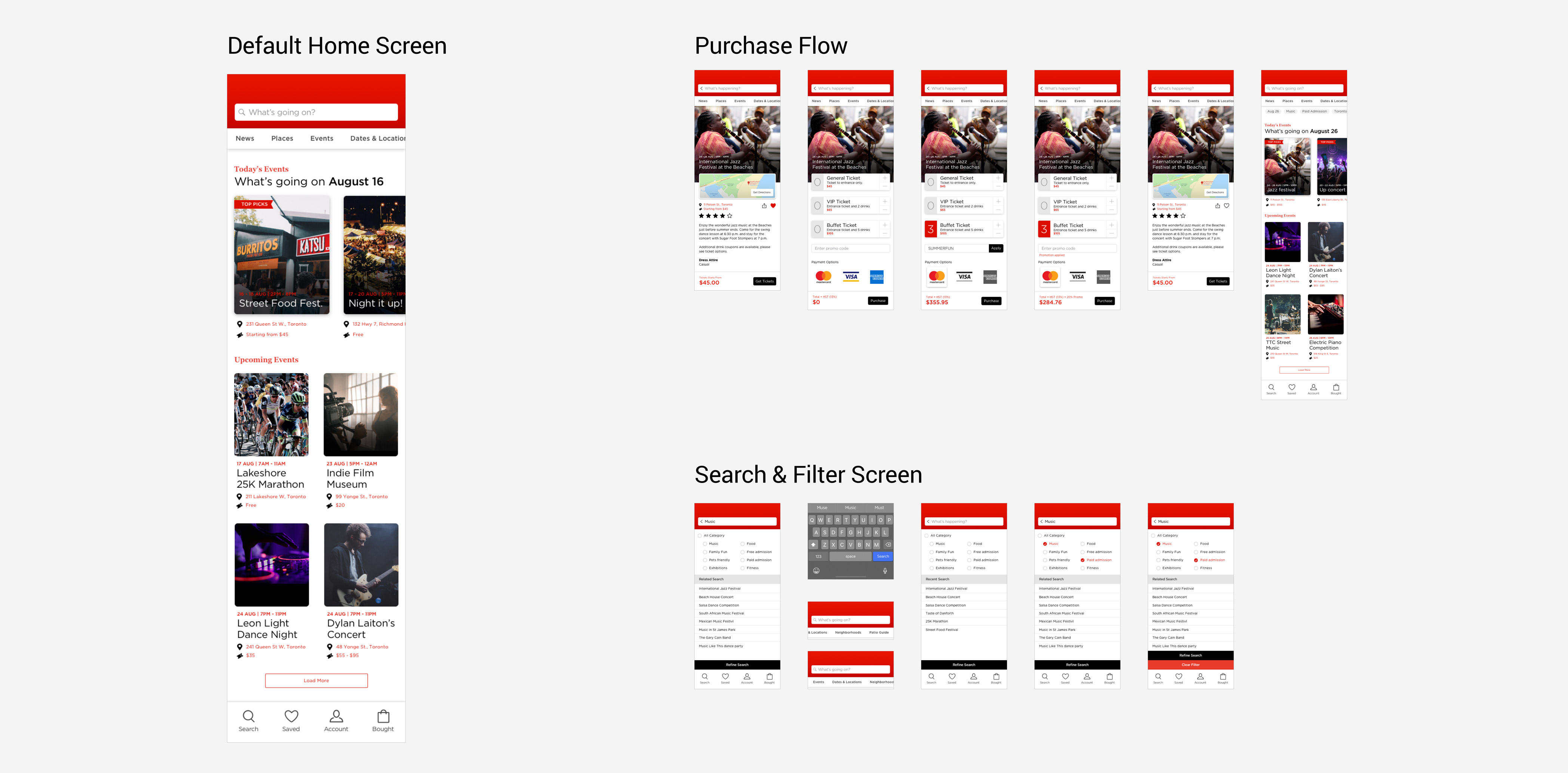
- • New navigation menu that allows user to access important information quicker
- • A dedicated search section that have filtering and recommended categories that meets different users' needs
- • New search bar is now always visible to the user making it more easily accessible
- • Search will continue to collect data to match user's interest, thus increase engagement
Solution
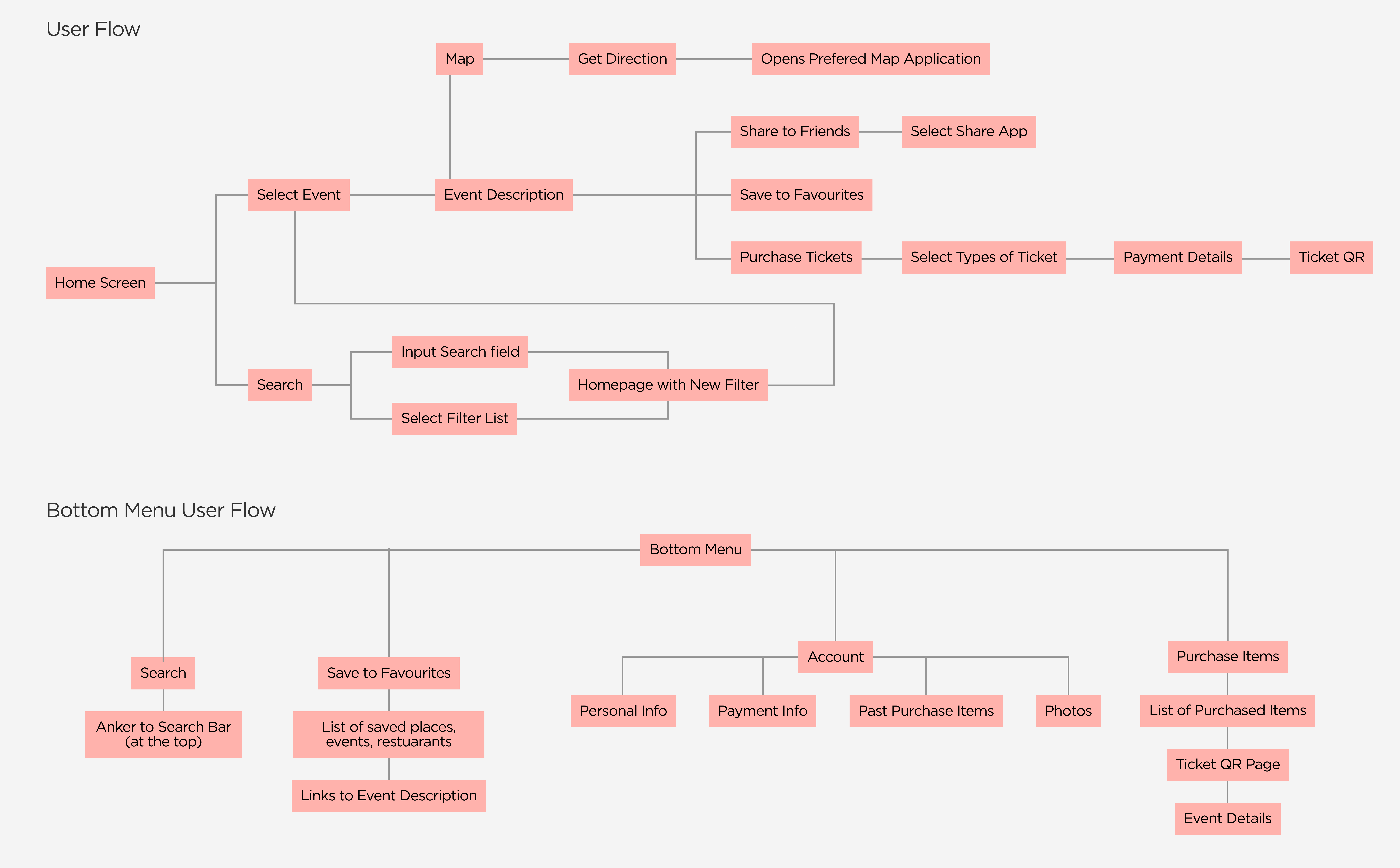
User flow and wireframes
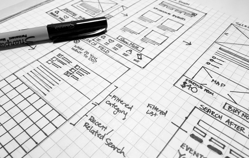
Once the user flow has been defined, sketching out wireframes is the next step. Often during this step I would ask for feedback, gather information if the experience is cohesive before moving on to high fidelity prototyping.


